One of the biggest complaints we’ve heard regarding iOS 7 is about the font change (the other complaint is usually about battery life, which is also extremely easy to fix). The new default system font is fairly narrow in weight, and as a result it can make text difficult to read throughout the various menus, settings, notifications, and even the Home Screen as icon text is quite thin.
If you find the default font and text to be difficult to read in iOS 7, stop squinting and take a moment to make a simple change that increases the weight of the font, making it bolder. This change is all encompassing and impacts all system fonts, and you will find nearly every text and font element to be much easier to read afterwards.
How to Make the iOS 7 Font Easier to Read with Bolder Text
- Open Settings and go to “General”, then choose “Accessibility”
- Scroll down to locate “Bold Text” and flip it ON
- Reboot the iPhone, iPad, iPod touch when asked
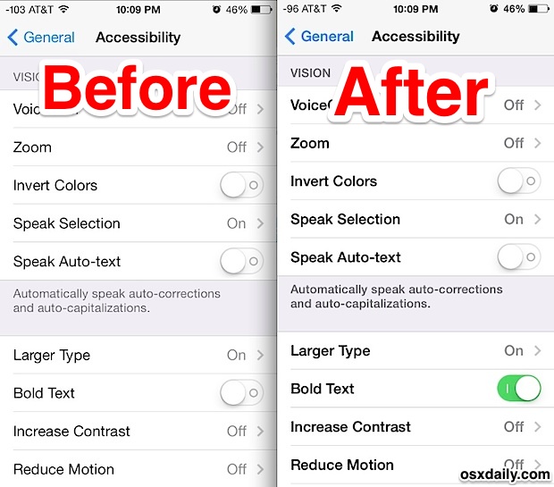
Don’t worry about the reboot process, it’s extremely fast nowadays so it only takes a few seconds to complete. When finished, the iPhone, iPad, or iPod touch will have bolder fonts that are much easier on the eyes. If you haven’t seen it yet don’t assume you’ll have big fat fonts, the ‘bold’ text is actually very similar in weight to the default font in prior versions of iOS. Below are a few screen shots demonstrating the difference of bold text vs normal text in iOS 7 on an iPhone 5.
The most significant change is shown in the Settings menus, where everything is much easier to read:

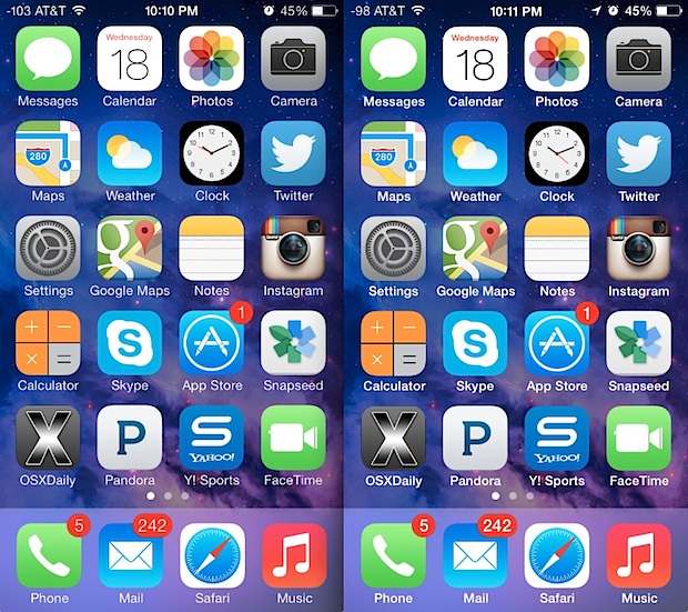
The home screen text under icons also gets the bold treatment, before is on the left and after is on the right:

You’ll find the lock screen, Notification Center, and Control Center are also impacted by the font change. This really is a systemwide adjustment, but screen shots really don’t do the change justice. If you find the text difficult to read in iOS 7 make the setting adjustment yourself to see just how big of a change it really offers, if you don’t like it you can always toggle it back off again and go back to the narrow text default. It looks great on the retina screens, but non-retina devices may find it to be an even greater improvement.
This seems to apply to everyone, and despite being in the “Accessibility” settings even those with very sharp eyesight tend to appreciate the bolder option. Make the change and you should be a bit happier with the iOS 7 experience, and don’t forget to master these four essential tips to jump ahead of the pack with iOS 7. The overall experience may be a bit different than we’ve all been accustomed to, but once you learn the basics you’ll find it’s very nice.
source
Post a Comment